Big Brands Who Enhance Their Web Presence with WordPress CMS
Across the Internet, having an influential, constantly updated website is the key to a strong web presence and high Google Rankings—one of the most sought-after treasures for brands big and small.
Can you guess what these brands have in common?
- Mashable
- Vogue
- Time Inc.
- Mercedes Benz
- The New Yorker
- Samsung
- Beyoncé
- James Bond Movies
- Bloomberg
Each of these brands boasts their own voice, niche and overall goals. They use different content strategies and marketing plans to reach their target markets and gain a loyal audience. But, while each of these 10 brands is unique, they all organize their content, post updates, and get the word out with a WordPress website.
WordPress is the foundation for a solid website presence.
WordPress is a content management system (CMS) growing in popularity by the day. Its blogging capabilities prove to serve regularly updated websites well. With its easy one-step posting, content scheduling, menu management, custom post types, custom fields, front end customization and simple back end organization, WordPress is the foundation for a solid website presence.
Mashable
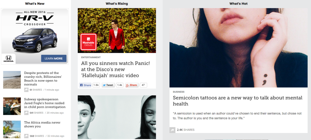
Find Your Articles: What’s New, What’s Rising and What’s Hot
Primarily, Mashable is a collection of articles—recent news, topics of interest, and trends—that are shown in varying levels of importance to entice users to read and share articles. Design-wise, we see headline font size, featured image and article placement as the major draws of attention. Their main navigation is subtle, giving more focus to exploring the trendy articles before you browse your favorite categories.
Vogue
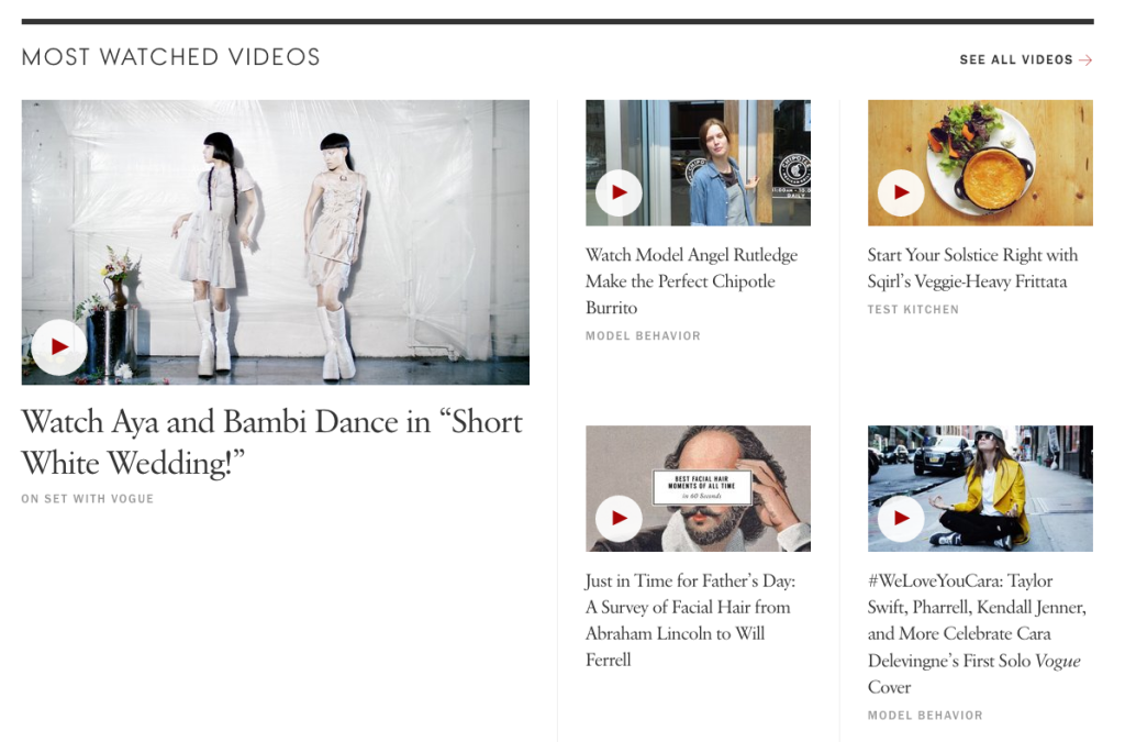
An online magazine that’s about more than just text.
For Vogue, there is a clean feel to the home page, and an encouragement to browse (as seen by the large logo leading your eyes to the main navigation and article categories). These categories have a greater emphasis here than at Mashable: the featured image, headline and category sizes are fairly balanced, making each article post on the front end more-so like the magazine itself, giving the site visitors complete control over what articles they choose to read.
Time Inc.
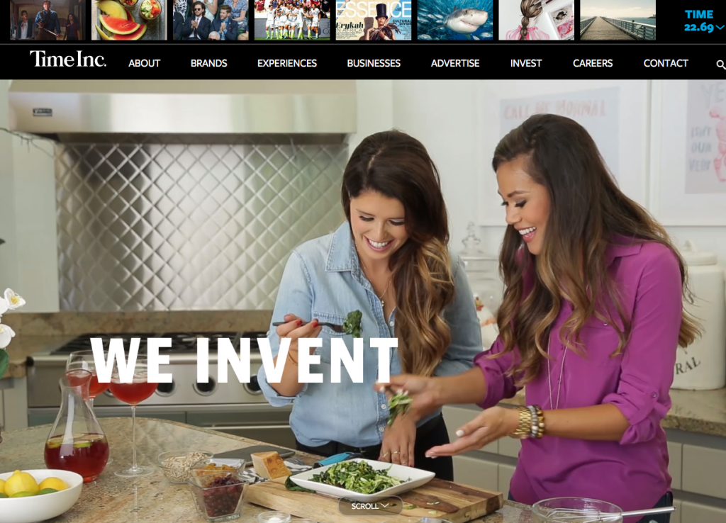
The Home Page: Engaging website visitors immediately and boldly.
At first glance, we catch the home page video acting as Time Inc.’s welcome “slide.” Contrary to the first two websites we explored, this website is more focused on the brand itself, previewing top magazine brands that fall under the Time Inc. umbrella, featuring a main navigation that expresses how the brand is an experience that you want to be a part of.
Mercedes Benz
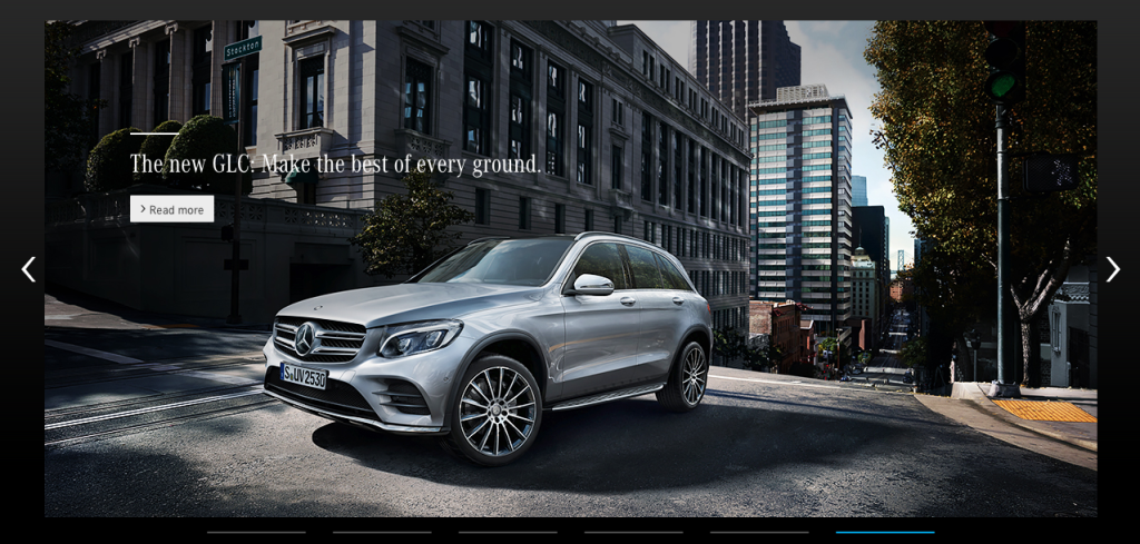
When images drive you to read (seriously, images can be a great messaging vehicle).
Mercedes-Benz highlights an obvious singular focal point on every page of their international website: the cars. When you visit the navigation, you see a progression from Vehicles to their associated categories (Innovation, Design, Classic, Sports, etc.). Mercedes takes you on a ride through the website, keeping your eyes flowing through a constant and moving stream of dynamic photos and slideshows that drive you through the content.
The New Yorker
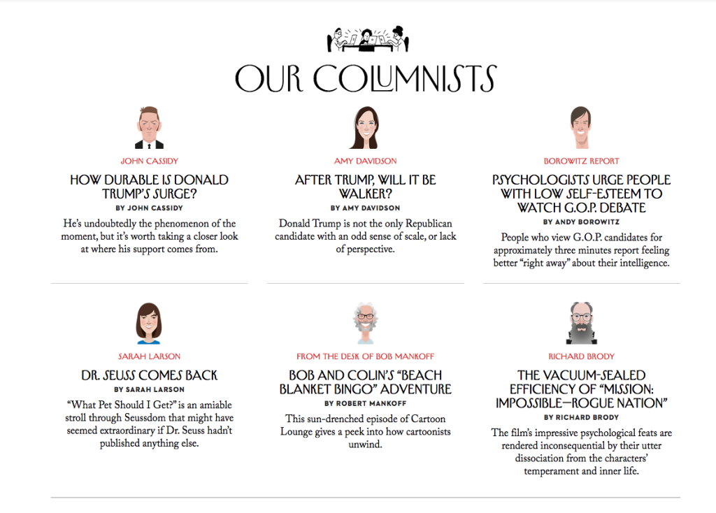
Customization: it’s all about the freedom to express your brand message.
The New Yorker separates its content much like a printed piece: Daily Comic, Daily Comment, Spotlight, News Desk, Page Turner and The Latest featuring articles and content on different topics, and so much more. With its simple white design, large headers, aesthetically pleasing font, interesting photos and large variety of content ranging from photo galleries to podcasts, this website is meant to be browsed (which you can do for free until you are met with a prompt to subscribe).
Samsung
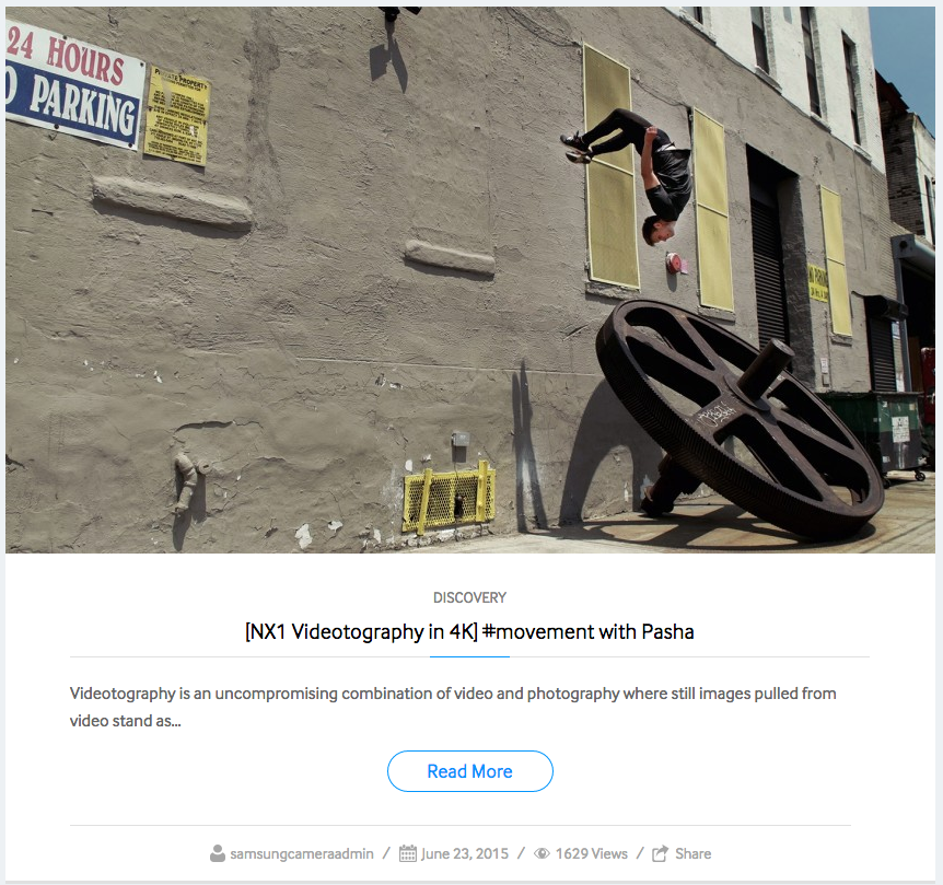
When design options that are flexible and dynamic, your products speak for themselves.
Here, Samsung gets creative by creating a website that bases its posts off of photos taken by its products, highlighting the numerous abilities of its cameras. With a main navigation sectioned into all of the post categories: News, Discovery, Products and a Photo Gallery anchoring the main navigation to the point, Samsung encourages site visitors to discover and explore its products with a single message: these are the cameras for you.
Beyoncé
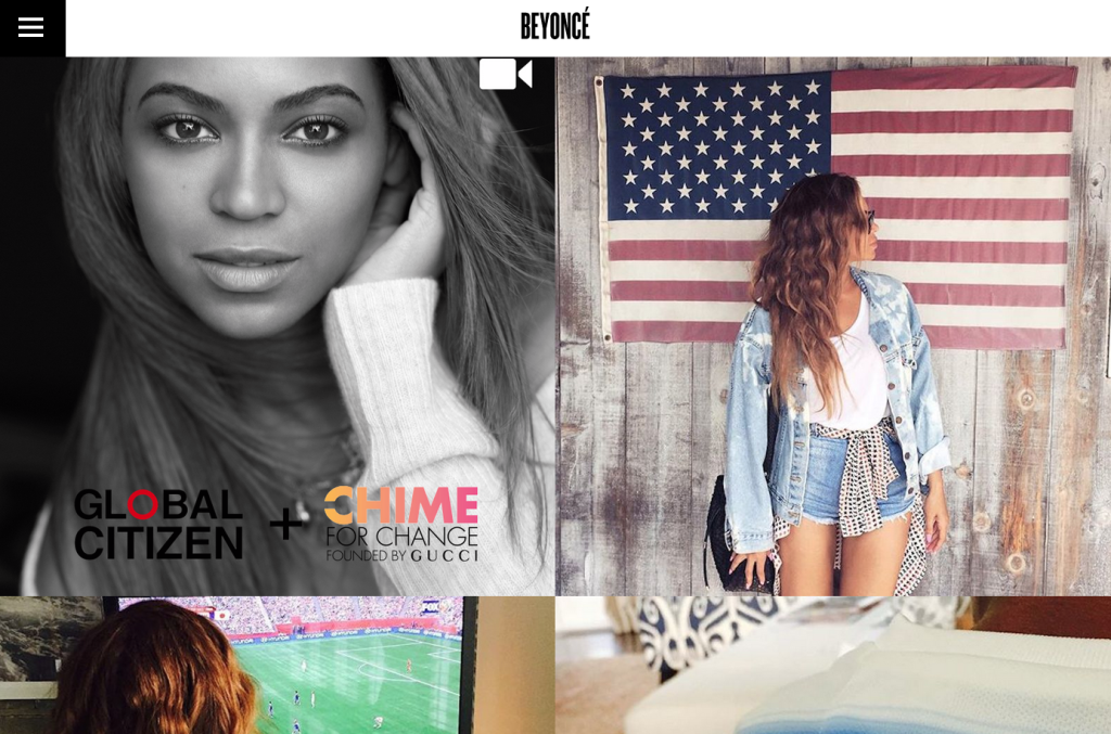
Take control of your brand and share your content with confidence.
This website is a tribute to Beyoncé—her life, her projects, her music, her tours and her products. The home page focuses more on her life, organizing posts by timestamp, and generally tagged “My Life,” with topics ranging from happy to serious to fashionable to flawless. Main navigation brings you through separate pages for her Music and Tours, but also features her signature hashtag: #BeyGood. Overall, we see a mixing of product promotion and personal blog—where you see the musician and meet the person all at once.
James Bond Movies
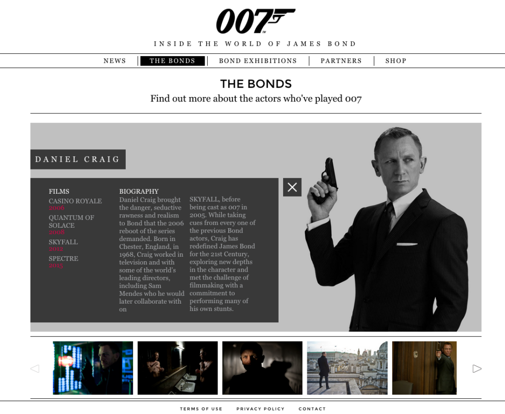
Good Websites always focus on user experience and functionality.
This website is all James Bond, all the time. You can explore the world of James Bond past and present: reading the bios of the different actors who played the character, checking out the different exhibitions, reading different posts, updates and photo galleries or browsing through and purchasing collectibles.
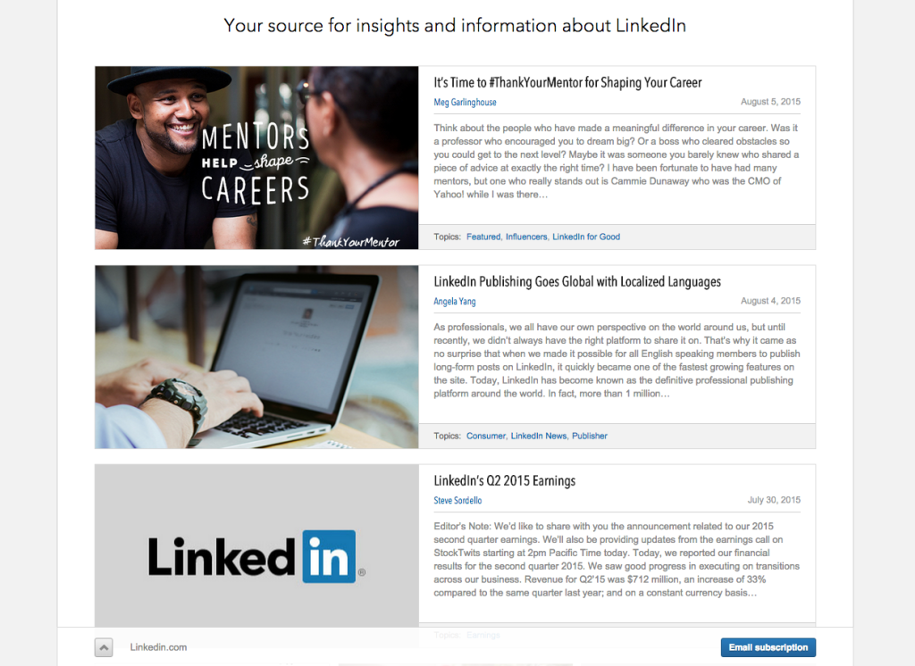
Information found: Organize your content easily with categories and tags.
At LinkedIn, simplicity reigns supreme with the focus being placed on articles. Here, it’s easy to click through the articles, whether we choose the featured articles on the home page or maneuver through the navigation to browse: Recent Posts, Popular Posts and posts by Topics. It sticks true to the main tagline and gives easy access to all LinkedIn insights and information.
Bloomberg
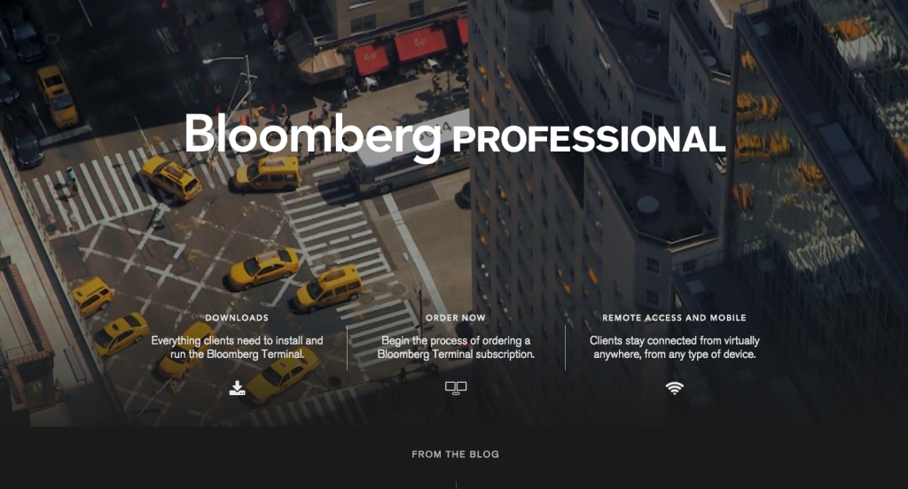
Even the most dynamic websites can be updated easily.
Bloomberg has gone all out on this home page—sporting a powerful video “slideshow,” a solutions-driven main navigation and continuous calls to action. This website provides posted articles by category or detailed explanatory pages on how Bloomberg can be a constant companion to the busy professional.